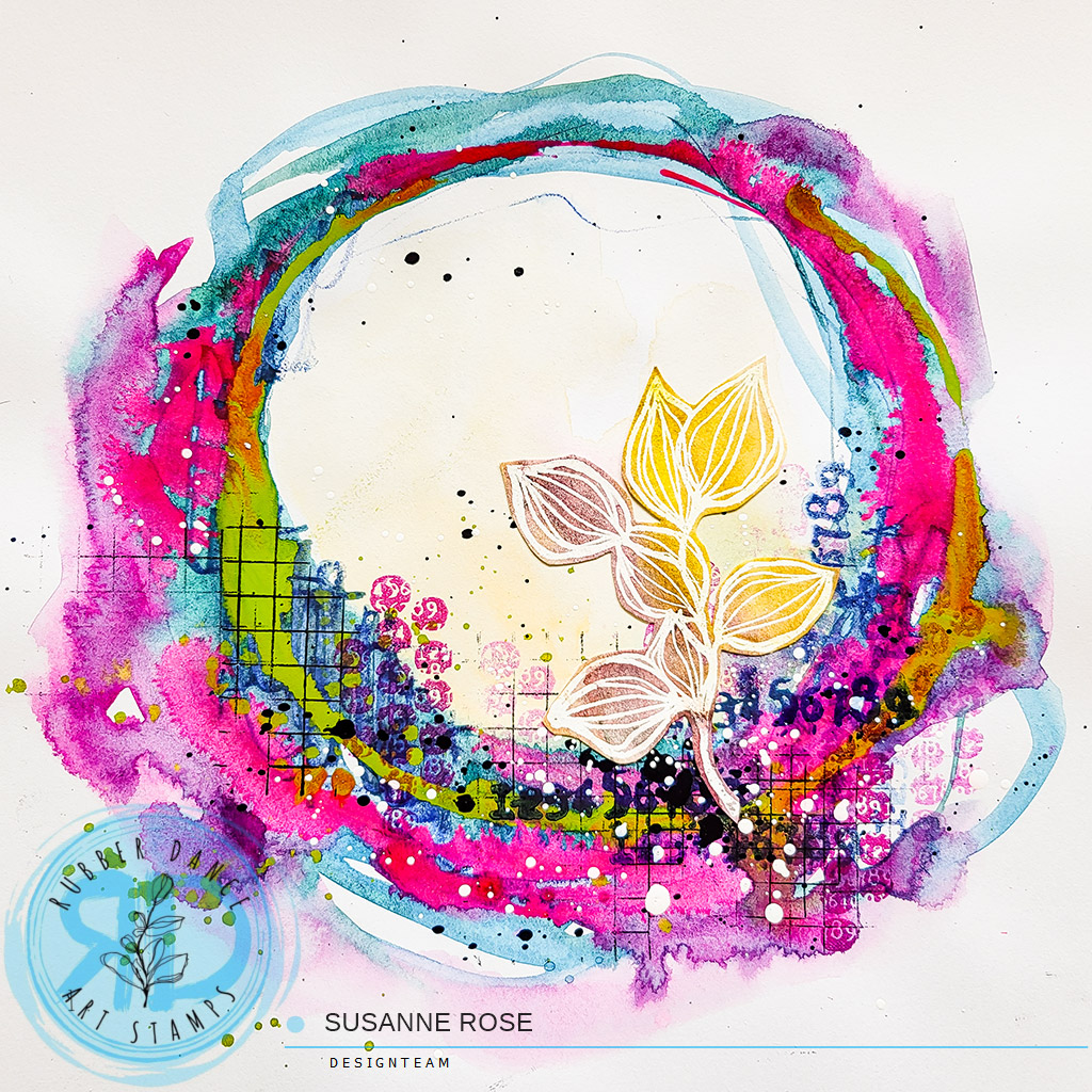
I am sharing a quick art journaling tutorial with watercolors and stamps over on our shop blog!
Continue reading “Abstract Art Journaling with Watercolors and Stamps”
Mixed Media Art Journaling, Stamping, Sketchbooking, Drawing & Painting! Enjoying the Process!
I am sharing a quick art journaling tutorial with watercolors and stamps over on our shop blog!
Continue reading “Abstract Art Journaling with Watercolors and Stamps”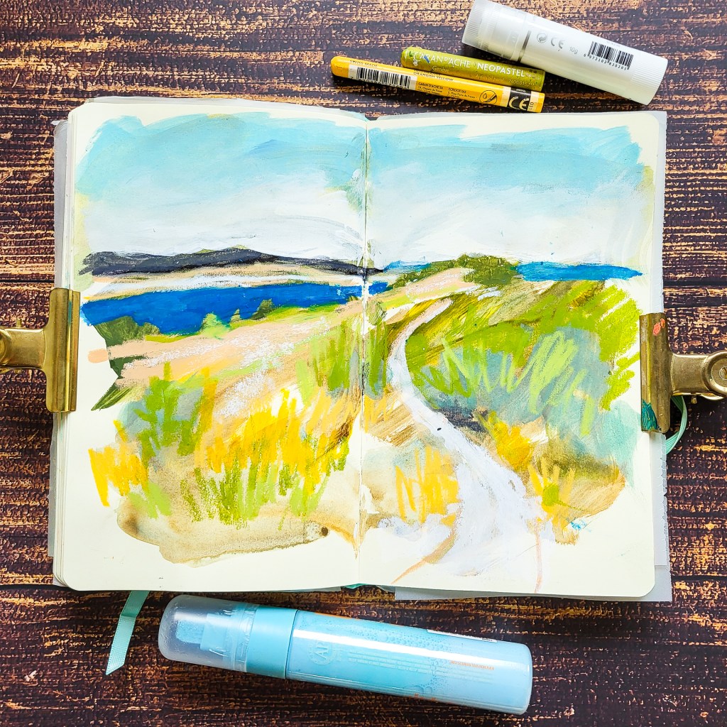
A really fun way to start a sketch is working on a preped background. That means I already have something going on and I can work with. It makes it easier to start a spread because it’s not blank anymore and it often leads to unexpected results. I have put two videos in the post to give you a little demo on how I made the backgrounds for the two spreads I am sharing today.
Eine Möglichkeite, die es etwas leichter macht, eine Seite im Sketchbook zu beginnen ist den Hintergrund schon mal vorzubereiten, bzw. zu grundieren. Wenn das Papier nicht mehr leer ist lässt es sich viel einfacher beginnen und es führt häufig zu unterwarteten Resultaten. In meinem Post zeige ich dir zwei Videos wie ich meine Hintergründe vorbereite.
Continue reading “Working on a preped background – Landscape Drawings”
I am sharing this mixed media art journal page with collage fodder over on our shop blog!
Continue reading “Layered Art Journal Page with Collage”
Over the past month I started drawing portraits a bit more regularly than usual. I find it very very hard! Usually the people don’t like like themselves in my drawings. Today I am sharing two portraits I am quite proud of. I really liked how those turned out. They are from a drawing session over ad Draw Brighton.
Im letzten Monat habe ich angefangen regelmäßiger Portraits zu zeichnen als gewöhnlich. Ich finde Portraits unheimlich schwer und meistens sehen die Personen in meinen Zeichnungen nicht aus wie sie selbst. Heute möchte ich zwei Zeichnungen zeigen, die mir recht gut gelungen sind. Sie sind aus zwei Zeichenstunden von Draw Brighton.
Continue reading “Portrait Drawings with Mixed Media”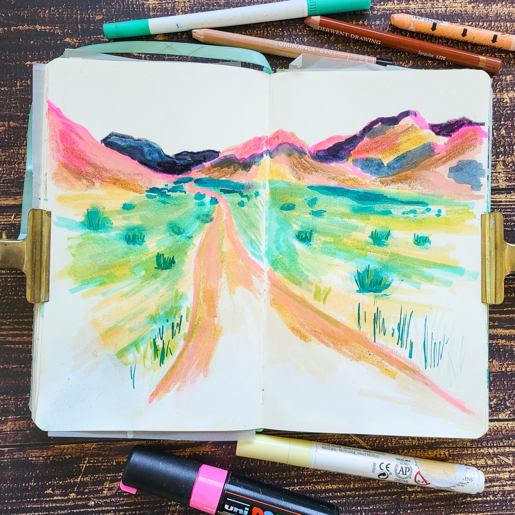
I the past I often tried to draw and paint landscapes in my sketchbooks with a different mood and with not so much green to achieve what I wanted. But it was truely so hard to do! I almost everytime grabed some kind of green… Recently I shared two landscape sketches without using green and a tip how this works more easily. I turned the reference images into black and white and then made myself a colour palette without any greens. For the image on the top I layered a yellow and turquoise watercolor marker and again made some green on the page….
In der Vergangenheit habe ich schon öfter Versucht in meinen Landschaftszeichnungen eine besondere Stimmung zu erzeugen. Das Ganze habe ich probiert indem ich möglichst kein Grün verwenden wollte. So einfach ist das aber gar nicht, man greift intuitive einfach gerne zum Grün. Vor einigen Tagen habe ich zwei andere Landschaftszeichnungen hier gezeigt bei denen ich einen kleinen Trick verwendet habe. Die Referenzbilder habe ich in schwarz/weiß umgewandelt und mir einen Farbpalette ohne Grüntöne zusammengestellt. Im oberen Bild hat selbst das mich nicht aufgehalten mit einem gelben und türkisen Aquarellmarker ein Grün zu mischen.
Continue reading “More Landscapes without using Greens!”
Hi everybody! I’m sharing an abstract art journal tutorial today and dive into mark making and transparent layering. Layers with texture and colours create depth in your abstract work. It makes your pieces interesting and the process is so enjoyable. For my spread I am using handmade collage papers, acrylic inks, paint pens, pencils and a few stamps.
Hallo zusammen. Heute zeige ich wieder eine Seite im Art Journal vom Action. Ich experimentiere mit transparenten Schichten aus Collagepapieren und Acryltinten. Außerdem ergänze ich einige Markmakings mit Buntstiften, Acrylmarkern und Stempeln. All die verschiedenen Schichten führen dazu, dass das fertige Werk Tiefe erhält, was vor allem bei abstrakten Bildern sinnvoll ist.
Continue reading “Mark Making and Transparent Layers – Video Tutorial”
Just another landscape with mixed media in my sketchbook! I love to use all kinds of mixed media just like a child.
Heute nochmal eine weiter Landschaft aus meinem Skizzenbuch. Ich liebe es ganz viele verschiedene Materialien zu verwenden und mit Ihnen zu spielen.
Continue reading “Landscape Sketch with Mixed Media”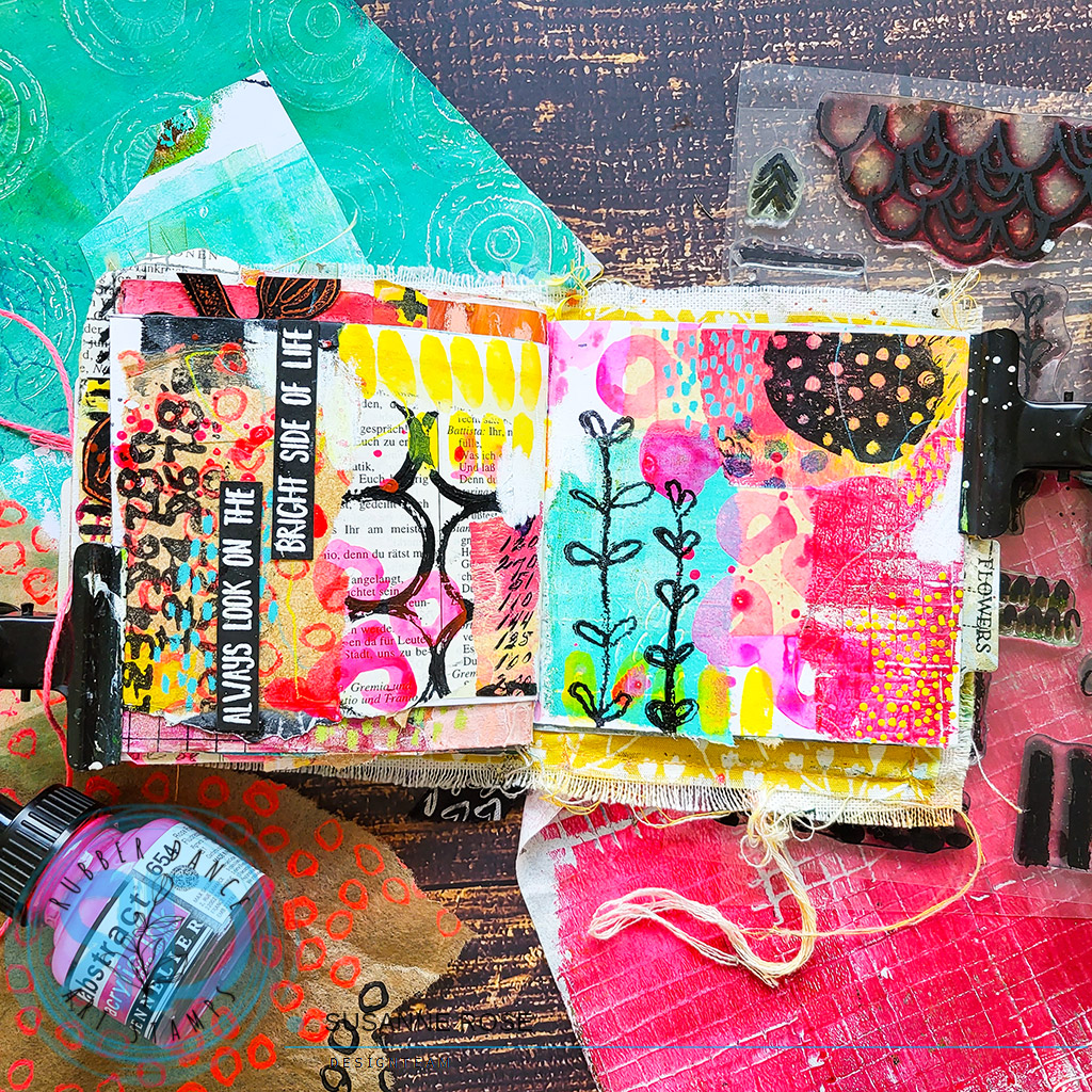
I’m sharing this art journal page over on our shop blog today. Jump over and have a look!
Continue reading “Abstract Junk Art Journal Page”
One thing I love doing is drawing on a prepped sketchbook page. This spread is done in my Ranger Journal with a background using Flash Paints from LeFrance & Bourgeoise. These paints are similar to acrylic gouache. They are drying mat and permanent. I love using them as a base layer in my sketchbook. As they are not sticky, it’s easy to work on top with all kinds of different materials. I shared some similar pages a week ago or so here.
Eine Sache, die ich besonders gern im Skizzenbuch mache, ist auf bereits bemalten Seiten zeichenen. Dieses Bild ist in meinem Ranger Skizzenbuchh entstanden. Den Hintergrund habe ich mit Flash-Paints von LeFrance & Bourgeoise gestaltet. Die Farben sind sehr ähnlich wie Acryl-Gouache. Sie trocknen matt und wasserfest. Man kann mit allen möglichen Materialien problemlos darauf arbeiten. Ich habe ähnliche Seiten vor ca. einer Woche in diesem Post gezeigt.
Continue reading “Sketching Boats – Working on a prepped Sketchbook Page”
Mixed Media index card with a cool stencil background idea using Distress Inks. A tutorial is over on our shop blog.
Continue reading “Stencil Background with Distress Inks”