
I’m sharing a new art journaling video tutorial over on our shop blog!
Continue reading “Mixed Media Art Journal Tutorial with Collage Fodder”
Mixed Media Art Journaling, Stamping, Sketchbooking, Drawing & Painting! Enjoying the Process!
I’m sharing a new art journaling video tutorial over on our shop blog!
Continue reading “Mixed Media Art Journal Tutorial with Collage Fodder”
Hi everybody. I am sharing a new art journaling vide today which is perfect for beginners. I am using Neocolor II crayons in my journal from Action, combined with some collage fodder and stamps from Pencil Marks 7. I kept the colors in pastel shades together with some black as contrast. For texture on the spread I adhered some collage papers in neutral colors first.
Hallo zusammen. Heute zeige ich wieder eine Seite im Art Journal vom Action. Ich starte mit ein wenig Collage mit neutralen Papieren und ergänze anschließen Farbe mit Neocolor II Kreiden. Das ganze runde ich ab mit schwarzen Stempelmotiven aus unserem Pencil Marks 7 Stempelset um den Kontrast zu erhöhen und etwas Collagefodder.
Continue reading “Easy Art Journaling Tutorial with Neocolors”
I am sharing an abstract art journal page with watercolors over on our shop blog.
Continue reading “Abstract Art Journaling with Watercolors”
I shared this big art journal spread over on our shop blog! If you are interested in the process you can subscribe to my exclusive Instagram content. There I am sharing extra videos each month with tips, tricks and tutorials all about mixed media and stamping.
Continue reading “Big double spread in my Art Journal”
I’m sharing an art journal spread over on our Shop Blog!
Continue reading “Artsy spread in my Junk Art Journal”
Today I am sharing two more landscapes from my sketchbook. In the evenings I often draw on the couch, in front of the TV, surrounded by many different art supplies that are not so messy. For the Oilpastels I am using the ones from Jaxon, as they don’t make a lot of mess.
Heute zeige ich zwei weitere Landschaften aus meinem Skizzenbuch. Am Abend zeichne ich oft auf der Couch vorm Fernseher umringt mit haufenweise Stiften, Kreiden und Markern, die nicht sooo viel Dreck machen. Da nehme ich immer die Ölpastellkreiden von Jaxon. Die sind zwar nicht so deckend wie andere aber dafür machen sie nicht so viel Schmutz.
Continue reading “By the Sea – Landscapes from my Sketchbook”
I’m sharing a full video tutorial on this art journal spread over on the Rubber Dance shop blog!
Continue reading “Mixed Media Collage Tutorial”
Hi there, Susanne here with a beginner friendly art journaling tutorial using an art journal from Action with watercolors directly on the paper. I’m creating an abstract layout and combine this with some stamps and mark making. It’s a very easy and relaxing process! Perfect to create some art when there’s not much time.
I really enjoy this art journal, it’s pretty simialar to the Dylusions Journal from Ranger. Of course the paper in the Ranger Sketchbook is better. But this one works perfectly, especially with mixed media!
Halli hallo. Heute zeige ich mal wieder eine abstrakte Seite mit Aquarellfarben im Art Journal vom Action. Ich gestalte die Seite mit den MeiLiang Farben von Paul Rubens, mit Mark Makings und einigen Stempelmotiven. Das Journal mag ich sehr gern! Es ist super günstig und das Papier eignet sich hervorragend für alle Mixed Media Techniken.
Continue reading “Abstract Watercolor Art Journal Page – Video Tutorial”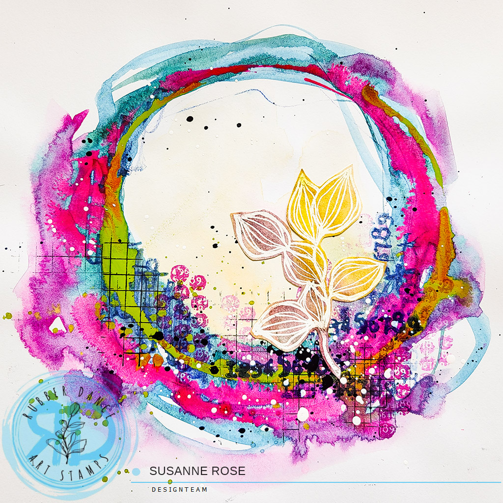
I am sharing a quick art journaling tutorial with watercolors and stamps over on our shop blog!
Continue reading “Abstract Art Journaling with Watercolors and Stamps”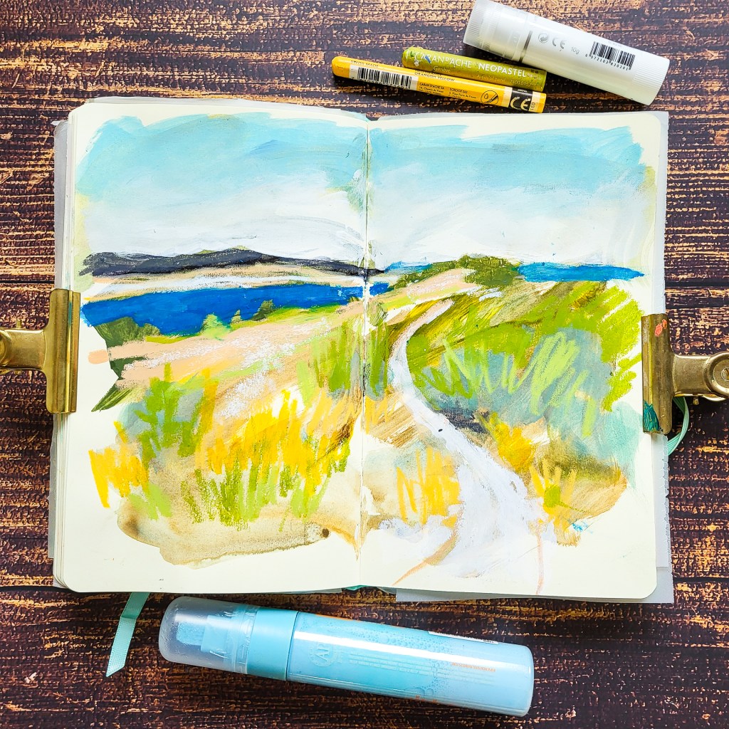
A really fun way to start a sketch is working on a preped background. That means I already have something going on and I can work with. It makes it easier to start a spread because it’s not blank anymore and it often leads to unexpected results. I have put two videos in the post to give you a little demo on how I made the backgrounds for the two spreads I am sharing today.
Eine Möglichkeite, die es etwas leichter macht, eine Seite im Sketchbook zu beginnen ist den Hintergrund schon mal vorzubereiten, bzw. zu grundieren. Wenn das Papier nicht mehr leer ist lässt es sich viel einfacher beginnen und es führt häufig zu unterwarteten Resultaten. In meinem Post zeige ich dir zwei Videos wie ich meine Hintergründe vorbereite.
Continue reading “Working on a preped background – Landscape Drawings”